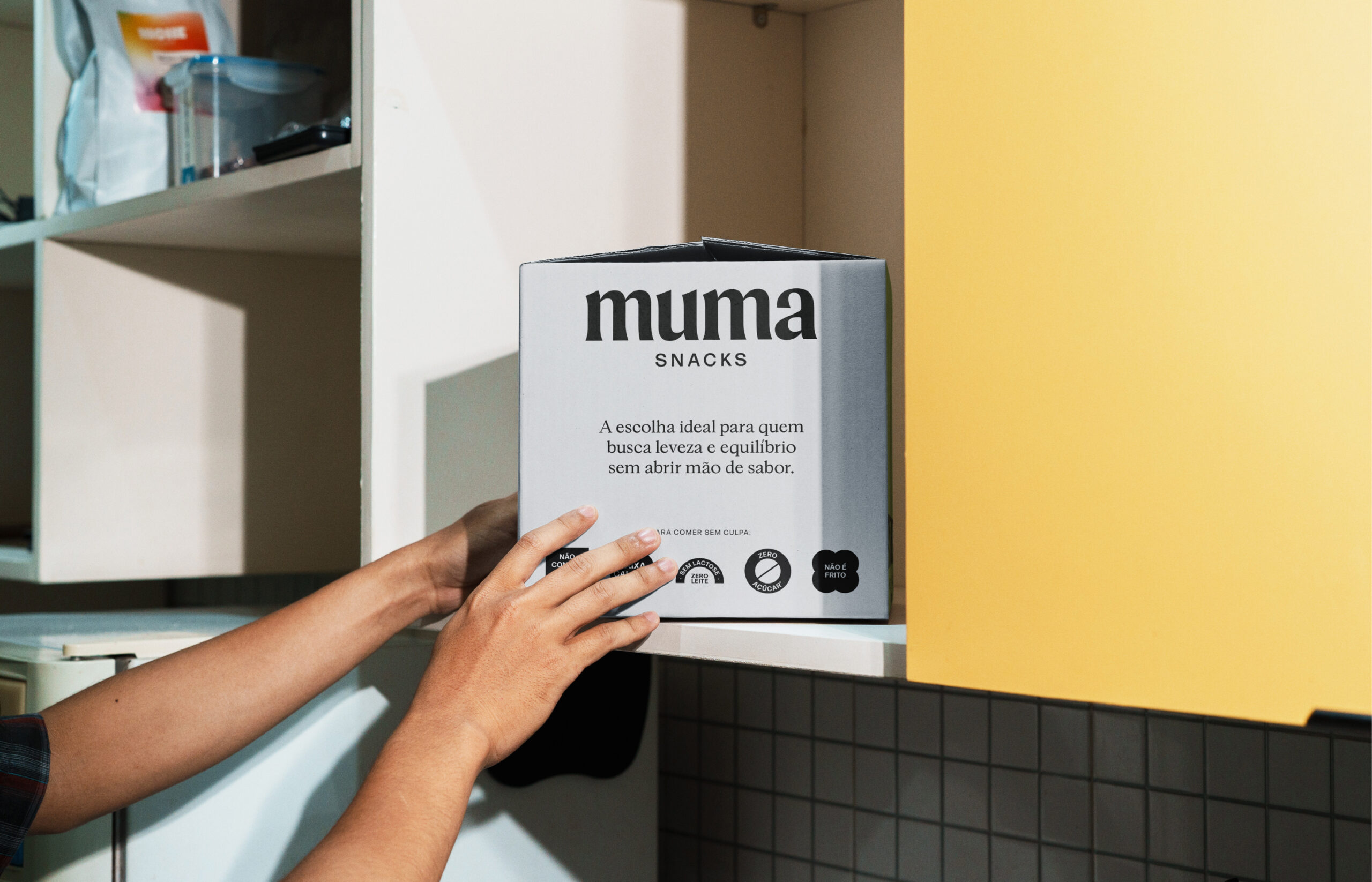
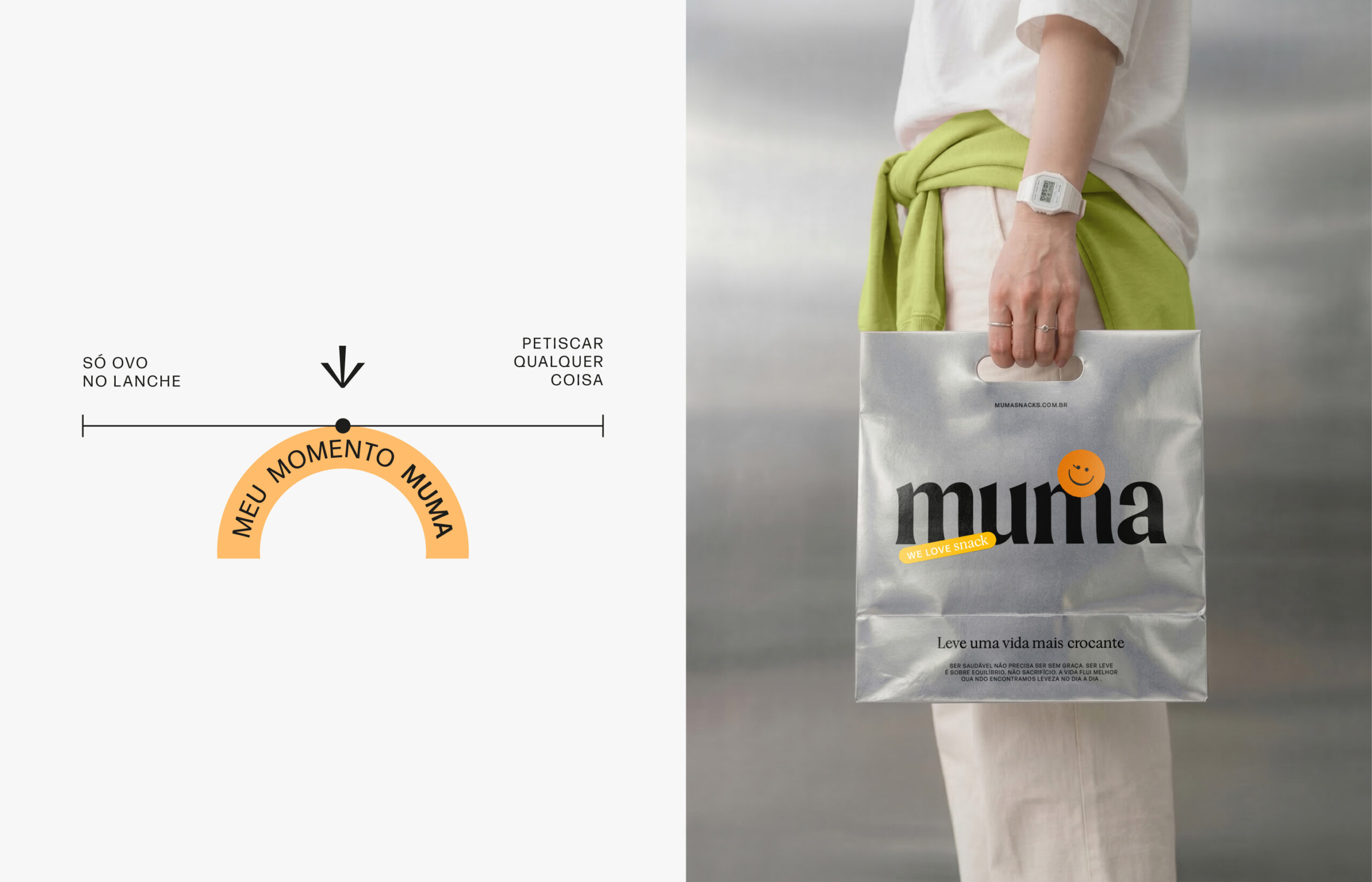
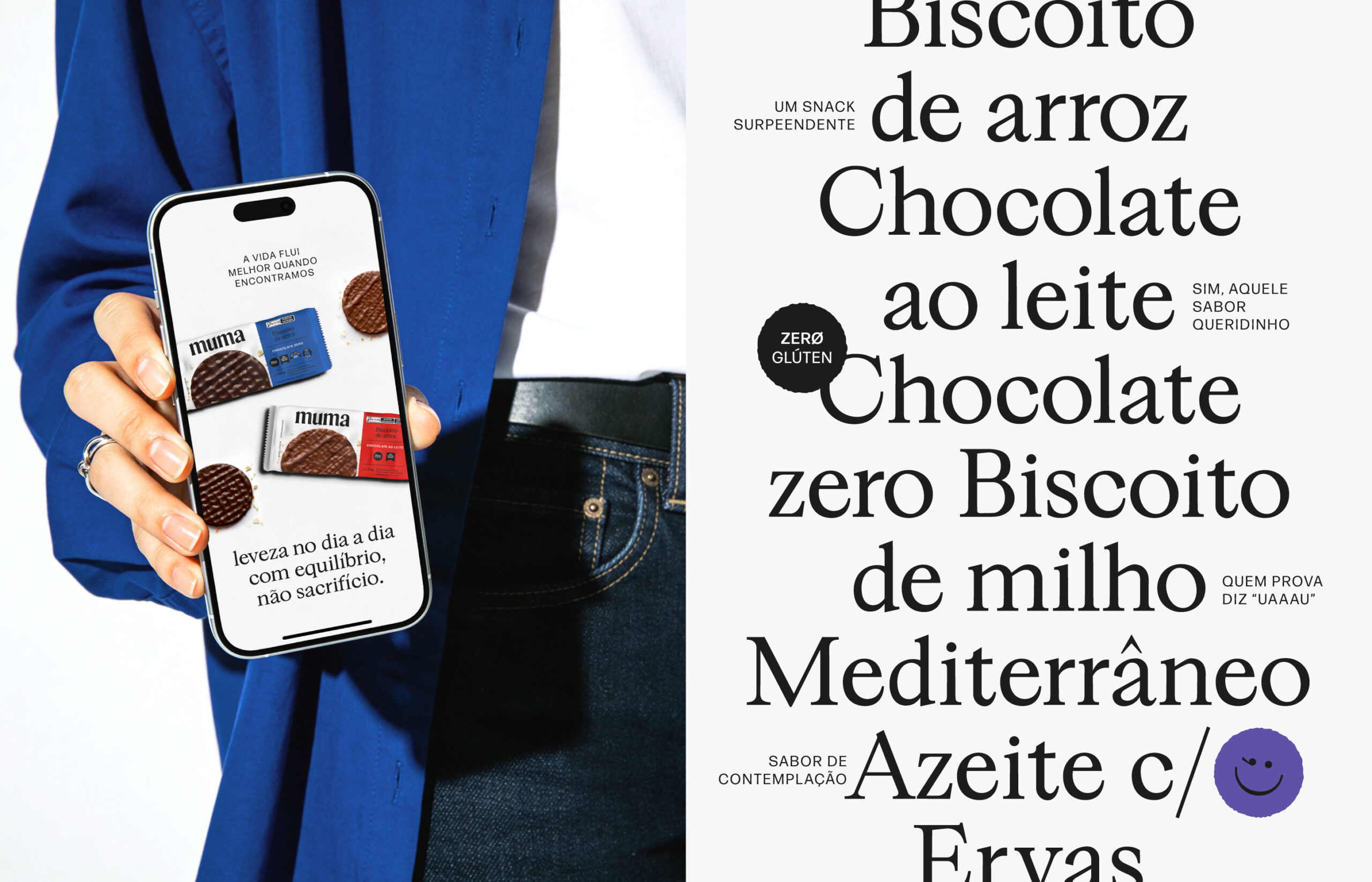
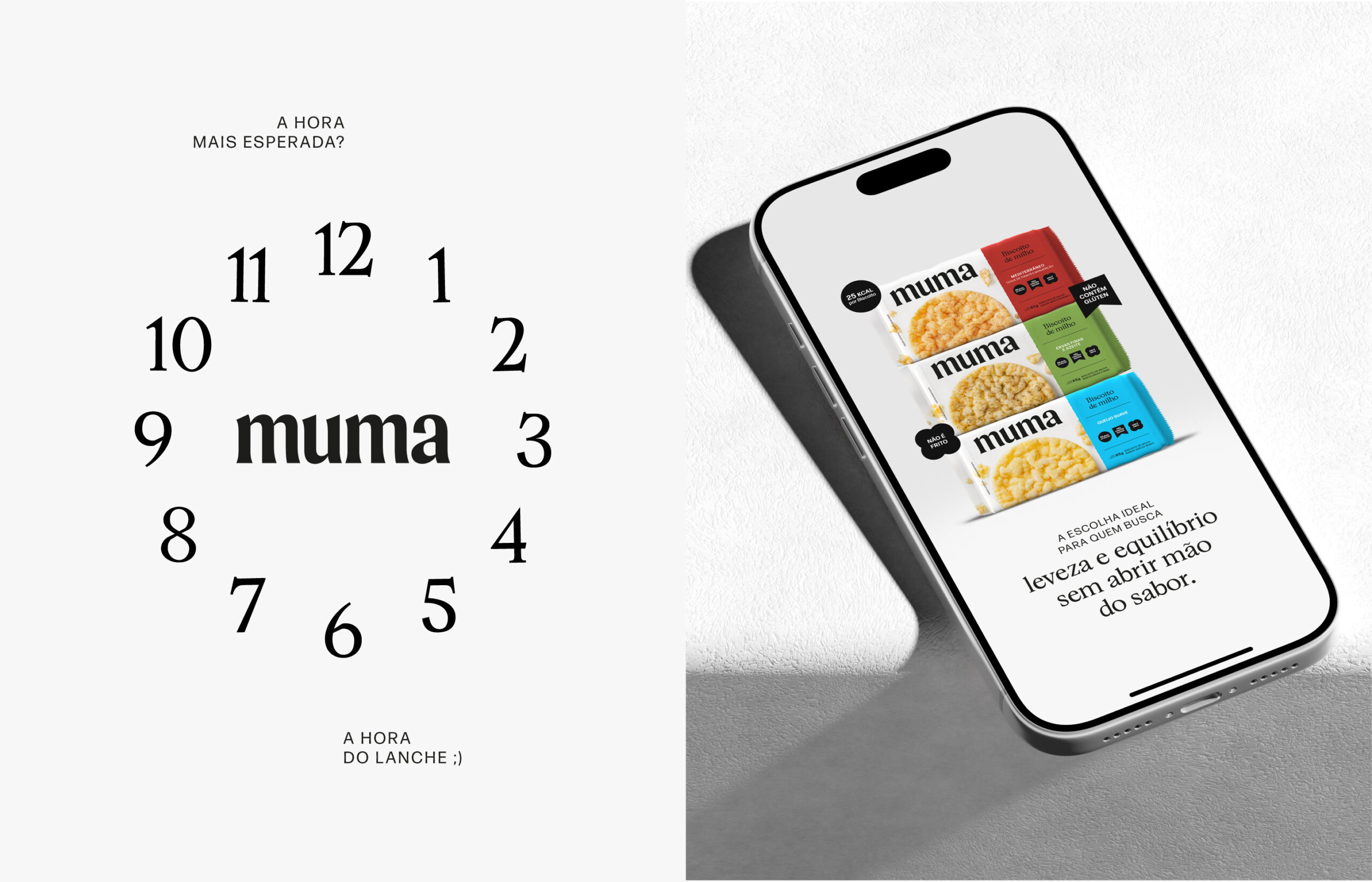
A Muma nasce para ocupar esse espaço entre o prazer e o equilíbrio, mostrando que um snack pode acompanhar a correria do dia sem abrir mão de sabor, crocância e bem-estar. O projeto parte de um insight claro: a vida flui melhor quando a leveza entra na rotina como escolha, não como renúncia.
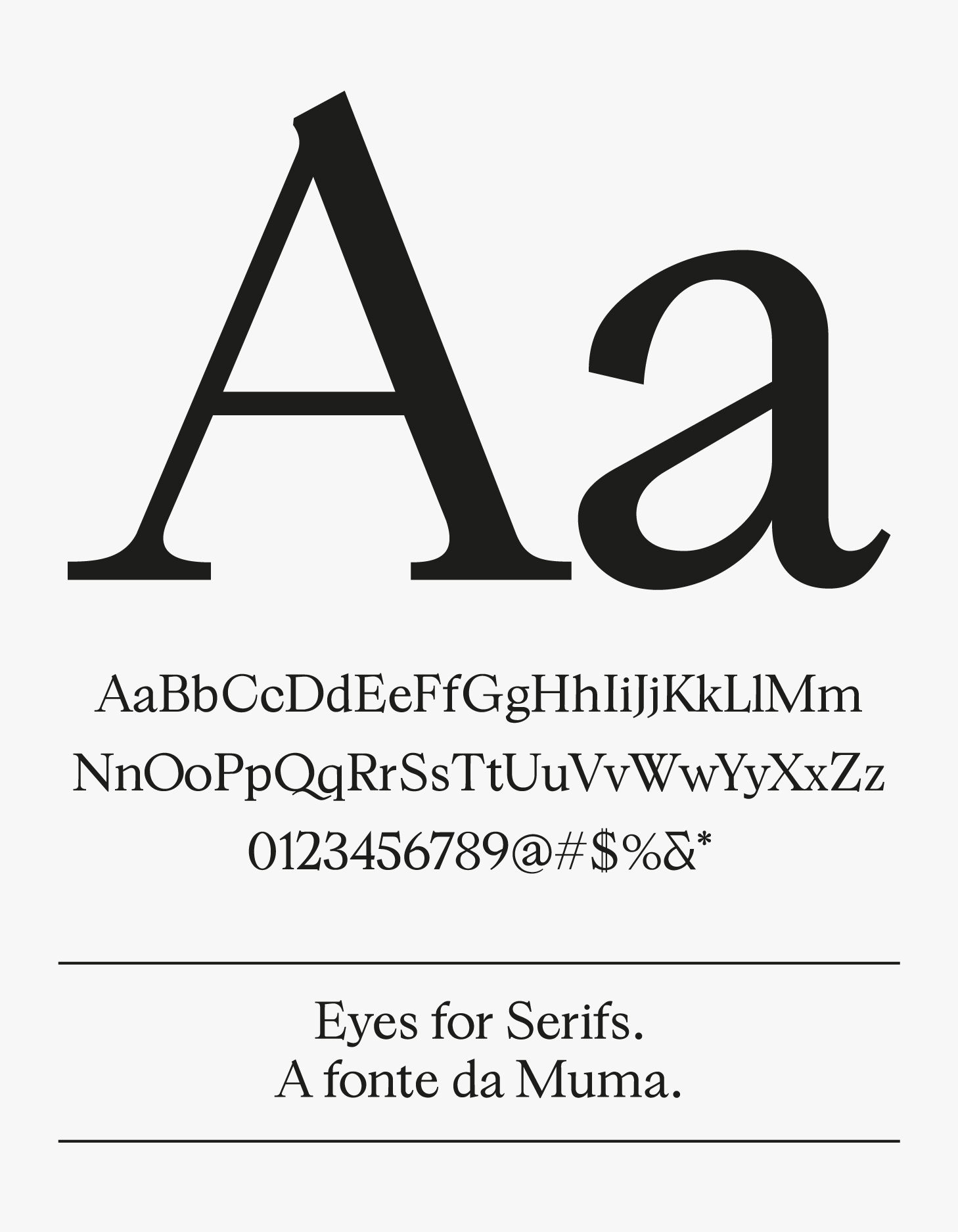
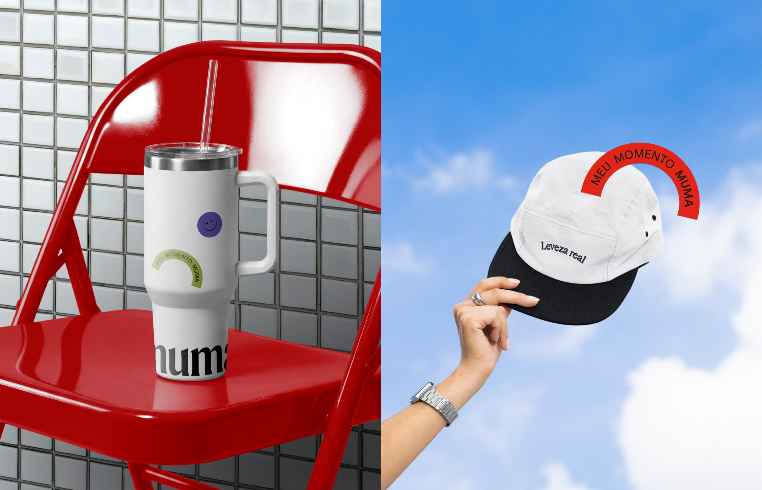
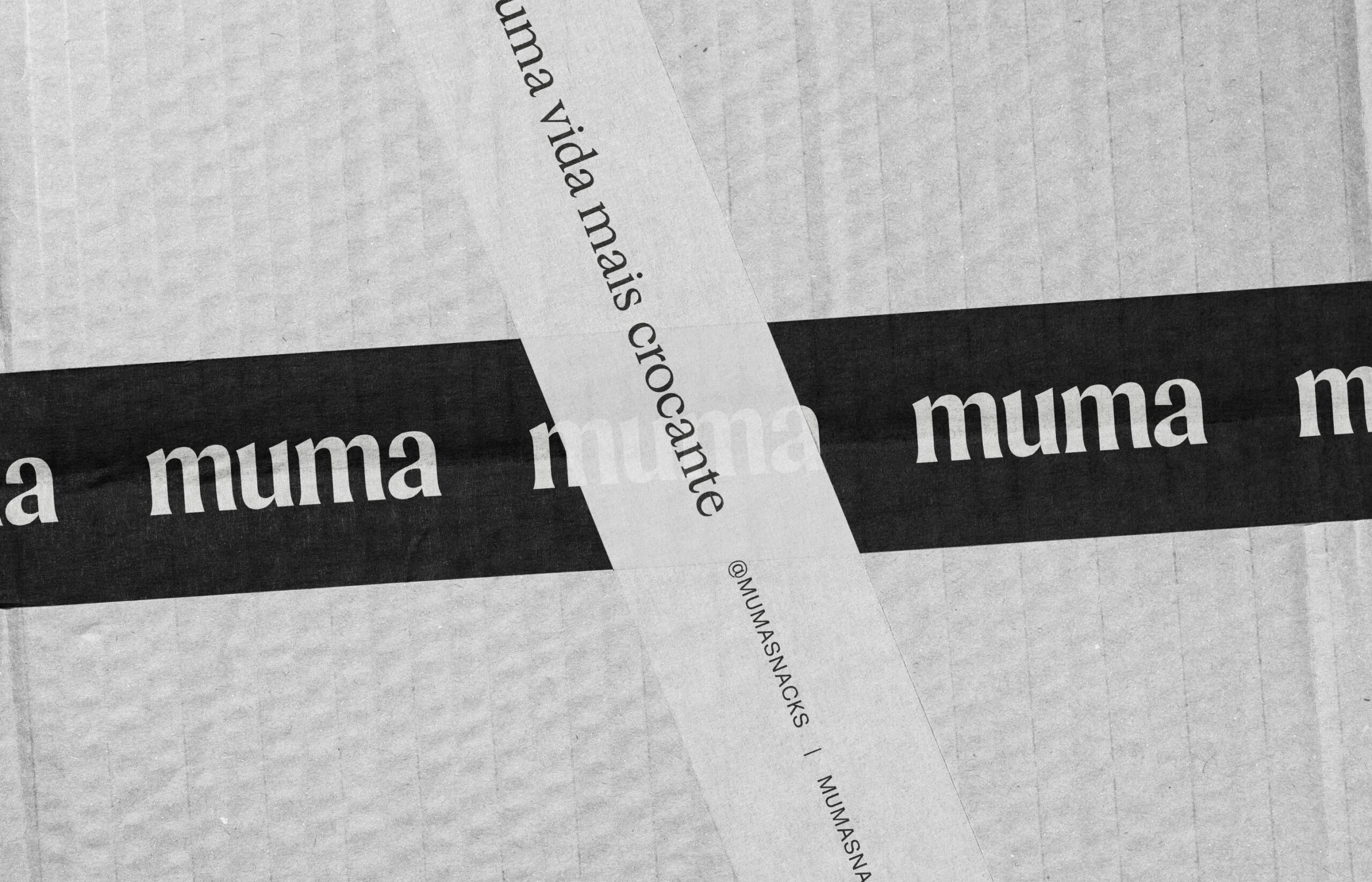
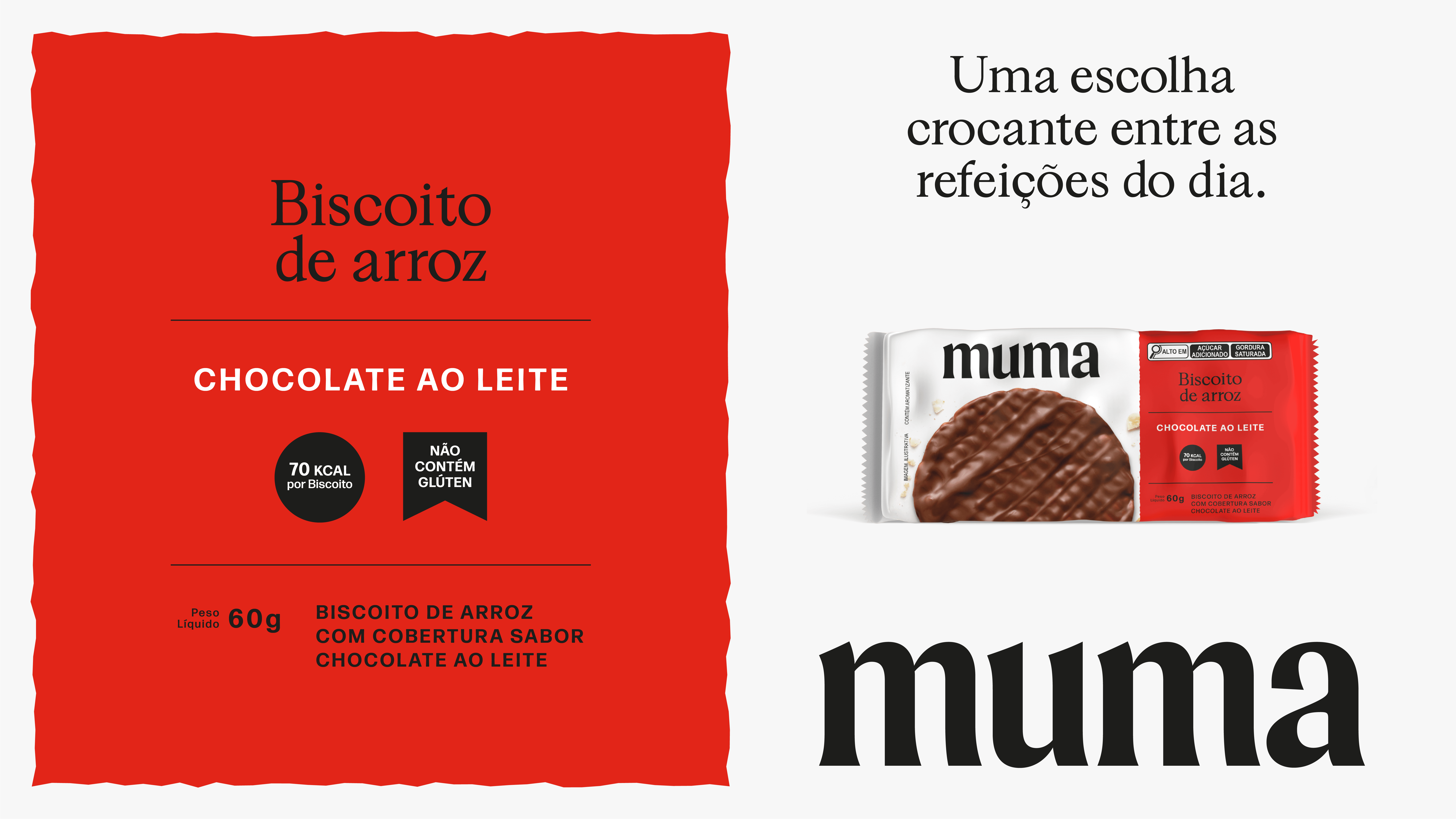
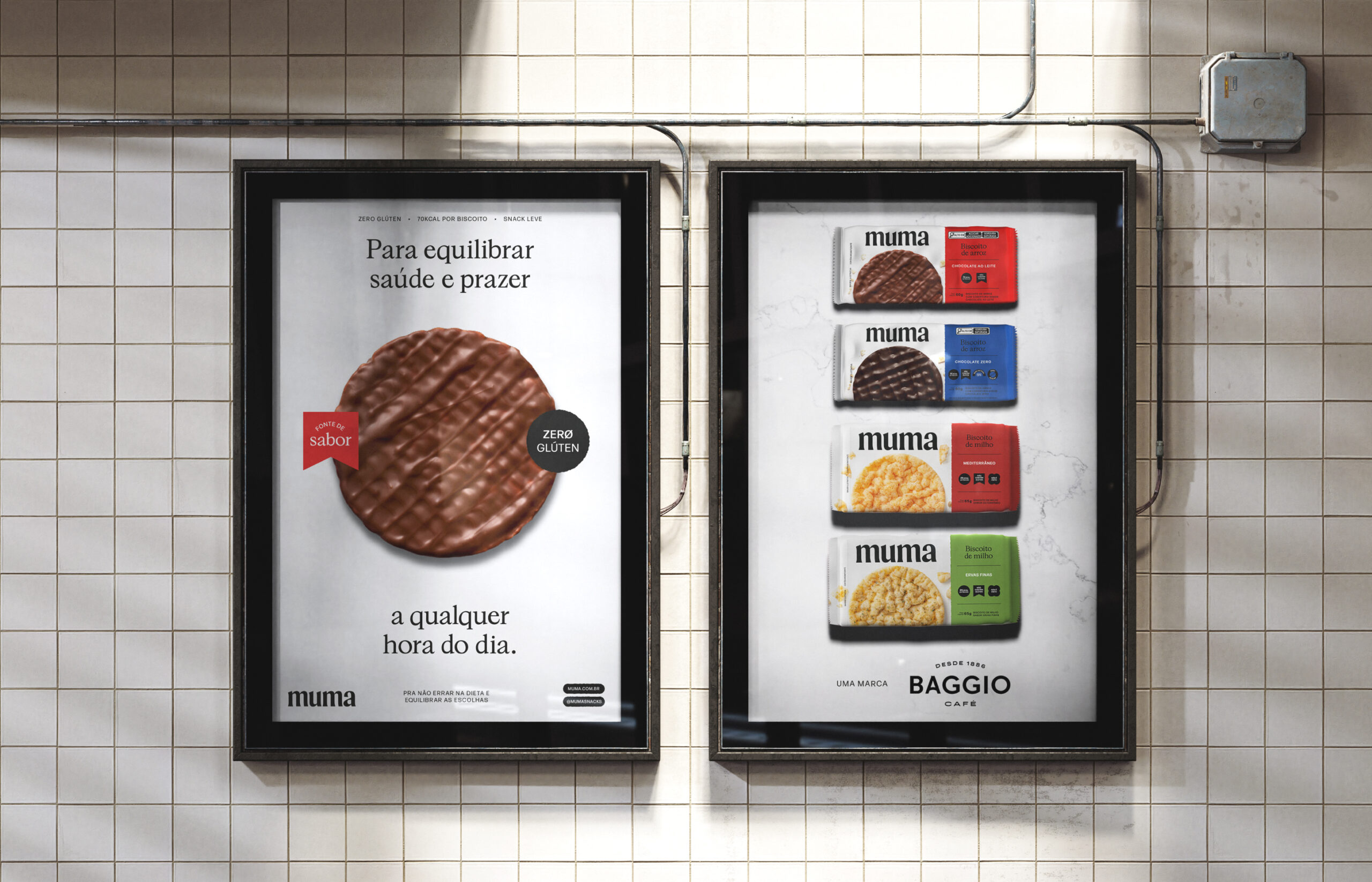
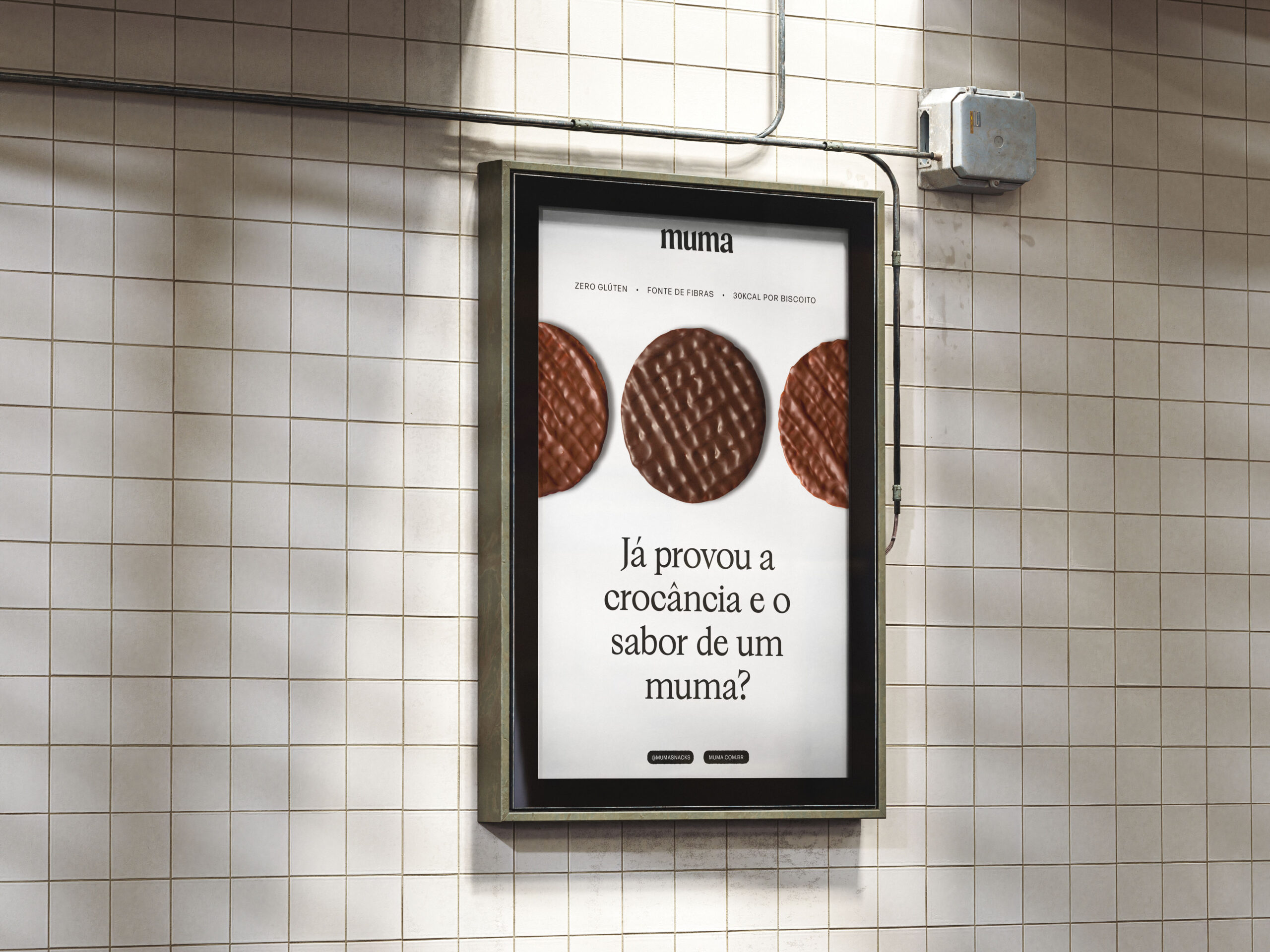
Na identidade, traduzimos essa ideia em um sistema limpo e sofisticado, com base branca, tipografia que equilibra maturidade e contemporaneidade, paleta que transita entre o leve e o indulgente e elementos gráficos que evocam textura e crocância. O resultado é uma marca jovem/adulta, confiante e bem resolvida no próprio território: falar de saúde com desejo, e de prazer com consciência.
EN
A light, crunchy and healthy choice.
Muma was created to live in that space between pleasure and balance—showing that a snack can keep up with everyday routines without giving up on flavor, crunch, and well-being. The project is grounded in a clear insight: life flows better when lightness becomes a choice, not a sacrifice.
Visually, we translated this idea into a clean and refined system, with a white base, typography that balances maturity and contemporaneity, a palette that moves between light and indulgent tones, and graphic elements that evoke texture and crunch. The result is a young-adult brand, confident and well-defined in its space: speaking about health with desire, and about pleasure with awareness.